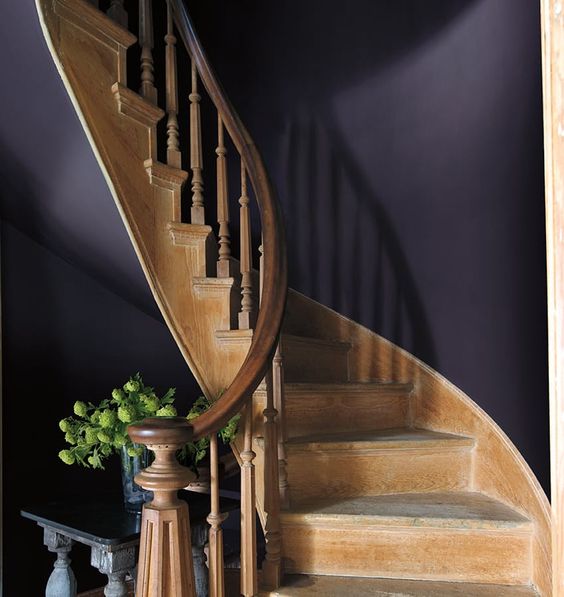
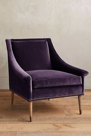
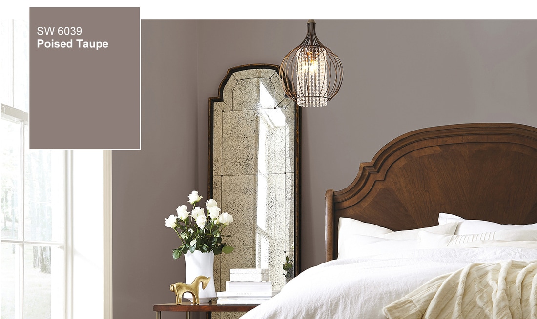
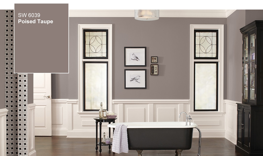
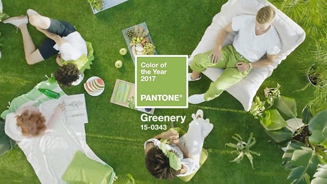
One's dark. One's moody. And one's fresh.It's that time of year again, when the big names in the color industry choose their colors of the year. Last year, no one saw it coming when Sherwin Williams and Benjamin Moore selected whites. And while they are their own distinctive companies, they are in step with each other yet again this year, both naming a deeper, more somber hue. Photos courtesy of Benjamin Moore.comIs it easy to use this color on the walls in your home? Mmmm, no. It's very, very dark. But it IS lovely. I envision Shadow for a wall color in a smaller room such as a powder room. It would work well with the contrast of a marble sink and floor, and with plumbing fixtures adding some shine. Or as a lovely upholstery color, such as on this Tillie Chair by Anthropologie. Luxe. And gorgeous. Tillie Chair and photo courtesy of Anthropologie. Who's Moody? Why, it's Sherwin Williams with its choice of Poised Taupe, SW 6039. This taupe, with purply-brown undertones, is another "serious" selection by our paint color folks. It's sophisticated, but it can be a tricky color to meld into a decorating scheme.Photo courtesy of Sherwin William Here it is in a bedroom in what I would call the perfect application. This color has to stand on its own, pairing well with a bevy of supporting neutral colors such as silvers, and creams. It looks awesome with mercury glass, chrome, and polished nickel to add some shine and to keep it from being too flat. Beware of trying to combine it with fresh colors, as they'll only serve to make this color look like mud. To use Poised Taupe successfully, pair it with metallics, rich velvety creams, black, and white. Here's another photo from Sherwin Williams. Note that both of these images keep the palette simple, with only three colors total - Poised Taupe, a light neutral, and a dark accent. That's where you're at with this one, folks.Photo courtesy of Sherwin Williams. And now for Fresh! Here's to Pantone with their choice of Greenery, I'll let them explain their own rationale for choosing this one for 2017.Image courtesy of Pantone I'm down with reassurance. And rejuvenating and revitalizing. I'll take 'em all! During my color course with the fabulous Maria Killam, I learned that the next decorating trend to hit (and take over the gray period), will be "FRESH." Clean colors, invigorating and cheerful hues. If what she predicts is true, then we will all be taking Greenery with us.Oh... and it just so happens that Greenery is the Spruce brand color. So I suppose it's no surprise that it makes me so happy. And did you notice? Scroll back to the first image of Benjamin Moore's Shadow..... what do you see there, perking up that photo? Why Greenery, of course!
2 Comments
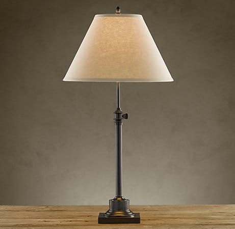
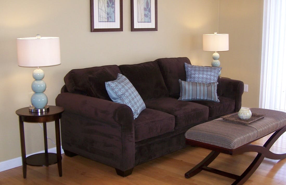
At a recent decorating consultation, my client asked me for ideas on how to make her living room feel more cozy. Her cavernous living room has nearly floor to ceiling windows, a massive stone fireplace, a cathedral ceiling and inset light fixtures – waaaay up above the seating area. To me, the solution was immediate – where were the table lamps? In this beautiful, open room, adding soft lighting would go a long way to warming up the space and bringing in the “cozy warmth” she was seeking. I have always had a thing about ambient light. I feel edgy and somewhat exposed if I am sitting down to read or watch TV while under (bright) overhead lighting. I need a table lamp. There is something comforting and cozy about having just the perfect lamp to sit with – a companion of sorts, a private pool of light to ground your seating area and provide that missing warmth. I didn’t realize how important this was to me until one of my matching living room lamps went to the repair shop. The (wonderful) dimmer switch had blown, and my electrician friend had taken it away for repair. Suddenly my reading corner was dark, and my room felt off balance. We brought in a replacement for the time being as there was a definite void in the room without that lamp. Pictured above is Restoration Hardware’s adjustable Library Table lamp – the very one I have in my living room. I love how it adjusts to just the right height, and of course I couldn’t live without the dimmer switch. Restoration Hardware has a great line of lighting- affordable, stylish, and accessible. I often recommend RH lamps to my clients. Now that mine has been reinstated in my living room, life is good … as balance has been restored. (That is, until the ice dam leak ruined the shade….more on that later!) Missing my lamp got me thinking about how much I love lamps in general – not just for the warmth that they provide, but also for the decorative punch that they bring to a room. I consider a beautiful lamp to be a room’s “jewelry.” Lamps are a fabulous way to bring in a jolt of color, a new shape, or a bit of sparkle… and are a huge part of the decorative impact in a living space. Over the past several months, I have had the opportunity to stage and decorate several properties – and by far, shopping for the lamps has become my favorite part. For one, I enjoy the quest of finding just the right shade style or lamp base – that one beautiful lamp that becomes a true attention grabber. I have often been asked if table lamps have to match – flanking the bed or a couch – and as much as I want to shout out YES, the real answer is no, as long as you follow some simple guidelines. In order to avoid the “roller coaster” effect, be sure the lamps on either side of the bed or couch are the same height. This can be achieved by using lamps that measure up the same, of course, but you can also fudge it by stacking the shorter of the two lamps on a pile of coffee table books. Having a similar shade style is also beneficial, providing symmetry and not confusing the eye with too many shapes. Pairing a drum shade and an empire bell shade won’t work, but using an empire shade in the same room with a bell shaped shade is much more harmonious. In another living room we staged, these blue lamps bring everything together – the brown room needed a jolt of color, but art and pillows alone didn’t totally fit the bill – until these lamps showed up. Like I said – jewelry! Jewelry I found at Home Goods for a steal. And since styles in lighting change just as much as jewelry styles do, don’t be afraid to try on something in a lamp that you might not ordinarily “wear.” At Home Goods most lamps are under $60, so you can splurge on one with a funky shaped base, or try something in a metallic finish and give some spice to your lighting!
And now for a bright ending to my ode to lamps. Just as soon as my lamp was back in action, as luck would have it an ice dam produced a lovely leak right on top of the shade. By the time we discovered it, there was a large water stain – a real bummer, for sure. (Alas, I didn’t think to snap a picture.) Before I trashed the shade and ordered a new one, I figured I had nothing to lose – so I googled and experimented and am proud to report a wonderful fix for water stains. A few scrubs with a soapy toothbrush to the water mark, and then a gentle rub with a damp cloth around the entirety of the shade – and the watermark was gone! Balance restored. The light is on. And cozy we are. |
Musings....These are things I think about. They wake me up at night and distract me from dusting. So I decided to write them down....Here's hoping they provide a fun diversion for you, and maybe a little inspiration too. ArchivesCategories |



 RSS Feed
