One's dark. One's moody. And one's fresh.It's that time of year again, when the big names in the color industry choose their colors of the year. Last year, no one saw it coming when Sherwin Williams and Benjamin Moore selected whites. And while they are their own distinctive companies, they are in step with each other yet again this year, both naming a deeper, more somber hue.
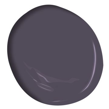
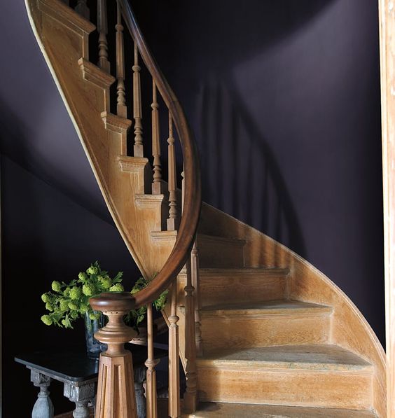
Photos courtesy of Benjamin Moore.comIs it easy to use this color on the walls in your home? Mmmm, no. It's very, very dark. But it IS lovely. I envision Shadow for a wall color in a smaller room such as a powder room. It would work well with the contrast of a marble sink and floor, and with plumbing fixtures adding some shine. Or as a lovely upholstery color, such as on this Tillie Chair by Anthropologie. Luxe. And gorgeous. 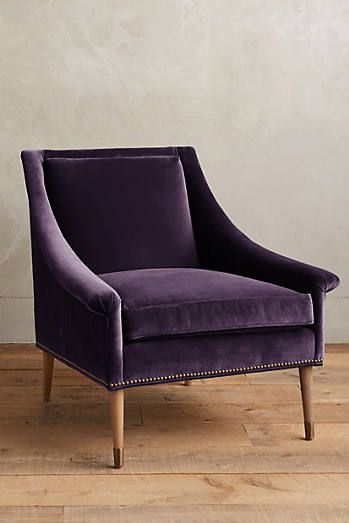 Tillie Chair and photo courtesy of Anthropologie. Who's Moody? Why, it's Sherwin Williams with its choice of Poised Taupe, SW 6039. This taupe, with purply-brown undertones, is another "serious" selection by our paint color folks. It's sophisticated, but it can be a tricky color to meld into a decorating scheme.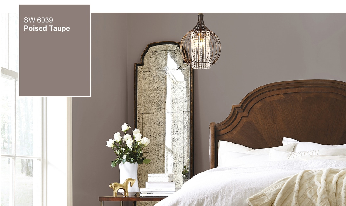 Photo courtesy of Sherwin William Here it is in a bedroom in what I would call the perfect application. This color has to stand on its own, pairing well with a bevy of supporting neutral colors such as silvers, and creams. It looks awesome with mercury glass, chrome, and polished nickel to add some shine and to keep it from being too flat. Beware of trying to combine it with fresh colors, as they'll only serve to make this color look like mud. To use Poised Taupe successfully, pair it with metallics, rich velvety creams, black, and white. Here's another photo from Sherwin Williams. Note that both of these images keep the palette simple, with only three colors total - Poised Taupe, a light neutral, and a dark accent. That's where you're at with this one, folks.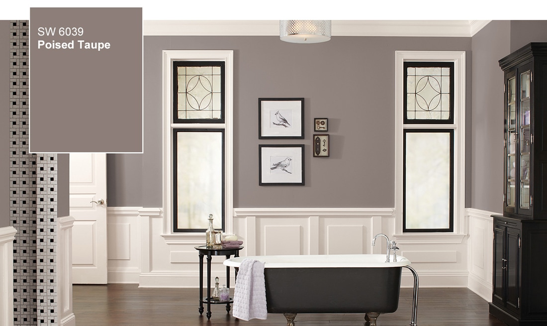 Photo courtesy of Sherwin Williams. And now for Fresh! Here's to Pantone with their choice of Greenery, I'll let them explain their own rationale for choosing this one for 2017.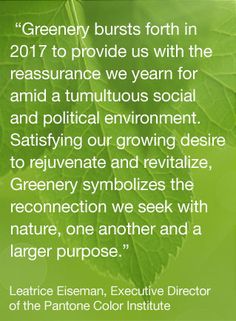 Image courtesy of Pantone I'm down with reassurance. And rejuvenating and revitalizing. I'll take 'em all! During my color course with the fabulous Maria Killam, I learned that the next decorating trend to hit (and take over the gray period), will be "FRESH." Clean colors, invigorating and cheerful hues. If what she predicts is true, then we will all be taking Greenery with us.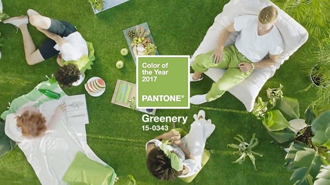 Oh... and it just so happens that Greenery is the Spruce brand color. So I suppose it's no surprise that it makes me so happy. And did you notice? Scroll back to the first image of Benjamin Moore's Shadow..... what do you see there, perking up that photo? Why Greenery, of course!
2 Comments
Leave a Reply. |
Musings....These are things I think about. They wake me up at night and distract me from dusting. So I decided to write them down....Here's hoping they provide a fun diversion for you, and maybe a little inspiration too. ArchivesCategories |
 RSS Feed
...love the room you're with |
|

Our design studio at 70 High Street in Hampton, NH is open by appointment and for special events.